Why your teapot is the best designed item in your home
Its design is so perfect, you won’t even notice it
“Well, that’s about as useful as a chocolate teapot!”
We’ve all heard that phrase before. And while a chocolate teapot certainly would be a pretty useless piece of household crockery, your standard non-cacao-based tea-brewer is without a doubt one of the most well-designed yet under-appreciated of all everyday household items. That might sound a bit dramatic – it’s only a teapot afterall, they’ve been around for centuries! – but the very fact that no one ever looks at their teapot and thinks “Wow, that thing is so brilliantly designed!” is a testament to just how well-designed it is. That’s because great design should be invisible – it shouldn’t get in the way of, or distract from, the very thing that the item has been designed to do.
De ja brew
To illustrate this, we can look at another everyday object that is very often badly designed: the door. Let’s set the scene. You’re in a rush on your way to an appointment, and you arrive at the unfamiliar building just in the nick of time. You dart up to the front door, wrap your hand around the handle, and give it a strong, confident pull. But nothing happens. You look up, confused, and see the word “PUSH” printed in large letters right above the handle. You roll your eyes at yourself for being such an idiot, look around to make sure no one noticed, and push your way sheepishly into the building.
You may not realise it at first glance, but this is a very badly designed door. In fact, it’s so badly designed that there’s a name for it – the Norman Door. People use doors every single day, and a Norman Door such as this is so badly designed that it needs instructions – “PUSH” – in order for people to work out how to use it. It’s also designed unintuitively. Handles are designed for pulling, and push panels are designed for pushing. When you see a door with a push panel you instinctively go to push it (after all, you have no choice) and when you see a door with a handle you instinctively pull it. It’s easy to blame yourself for failing to read the giant PUSH and PULL signs (which themselves are very similar-looking words), but in reality, those mini instruction manuals shouldn’t need to be there to begin with. It’s a door, not a brand new washing machine.
Not too hot, not too cold, just right
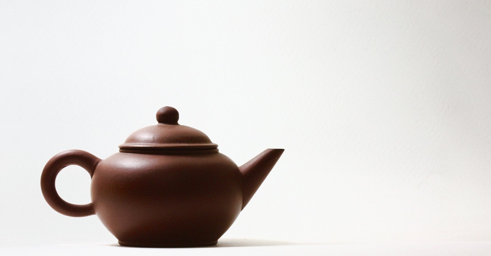
This leads us back to the humble teapot, a tool that’s been designed so intuitively that it’s near impossible to use one badly – which, of course, is by design. The teapot in essence is a collection of different elements that have all been pieced together to create a seamless brewing & pouring experience. There’s a handle, of course, which sits directly opposite the spout. The spout is curved to create a smooth pour, with a slight lip to prevent unwanted dripping, and the head of the spout sits taller than the top of the pot. The pot is usually spherical for maximum convection, with a raised base to prevent heat being lost to the surface it sits on. Atop the pot is a lid, which is usually circular with a semi-circular base (so the lid will only fit one way) and a small air hole and a lip that extends out from the lid into the pot, pointing towards the handle.
 “A simple lip & air hole are hardly noticeable, but are the difference between a smooth pour and a calamity”
As we know so well from the ‘chocolate teapot’ idiom, changing just one feature of a teapot can render it completely useless – chocolate melts when heated. But this is true of these other features too. If the handle and spout sat anything other than directly opposite each other, pouring would become increasingly more difficult the closer together they became. If they sat on the same side of the teapot, pouring would become literally impossible. Similarly, if the spout sat lower than the top of the pot, then water would start to leak out of the spout before the pot itself could be filled. If the lid didn’t have an air hole, pouring would become a very messy affair – and if the lip that extended from the lid into the pot pointing towards the handle wasn’t there, then the lid would fall off every time you tried to pour a tasty night-time chamomile. And none of that, if we’re honest, is anybody’s cup of tea.
 “Making a teapot out of chocolate isn’t the only way to make it totally useless.”
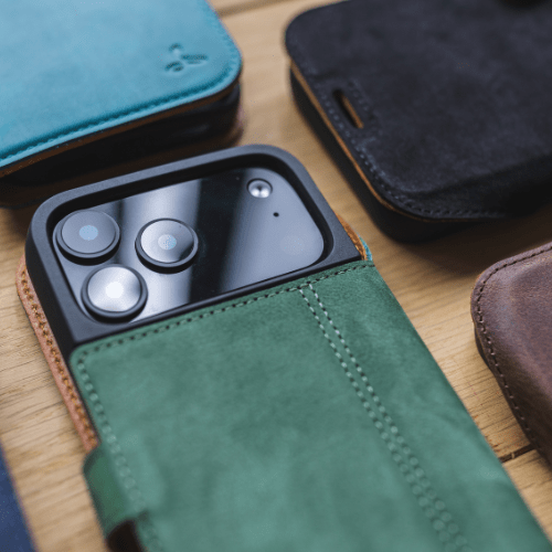
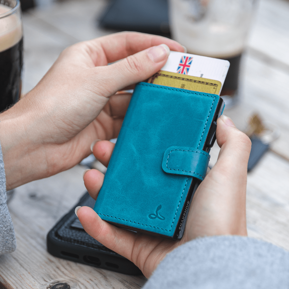
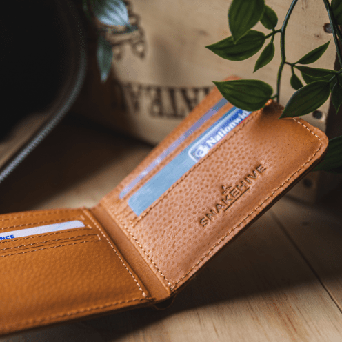
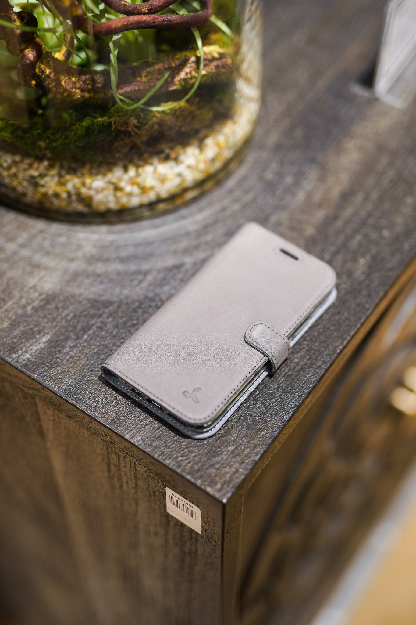
Great design is invisible. The reason we don’t think of the teapot as being brilliantly designed, is precisely because it is. The same is true of the housekey, the desk chair, and a number of Snakehive’s carry accessories – from our Metro Leather Case with a built-in two-way kickstand, to our Metro Leather Cardholder with a hidden anti-slip spring that keeps your cards locked in place. We’re big fans of simple but effective design, and often find ourselves looking to innovations like the teapot to keep us curious and inspired. So the next time you’re pouring yourself an afternoon cuppa (or charging your iPhone with your MagSafe-compatible Metro Leather Case), take a moment to appreciate the small little details that someone, somewhere, at some point took the time to really think through. I’ll drink to that!

“The humble teapot – one of the best-designed household items in your home”


